| Project Scope:
Branding & Identity / Art Direction / Graphic Design / Digital Illustration / Merchandise Creation
| Tools used:
Illustrator / Photoshop / Procreate
| Overview:
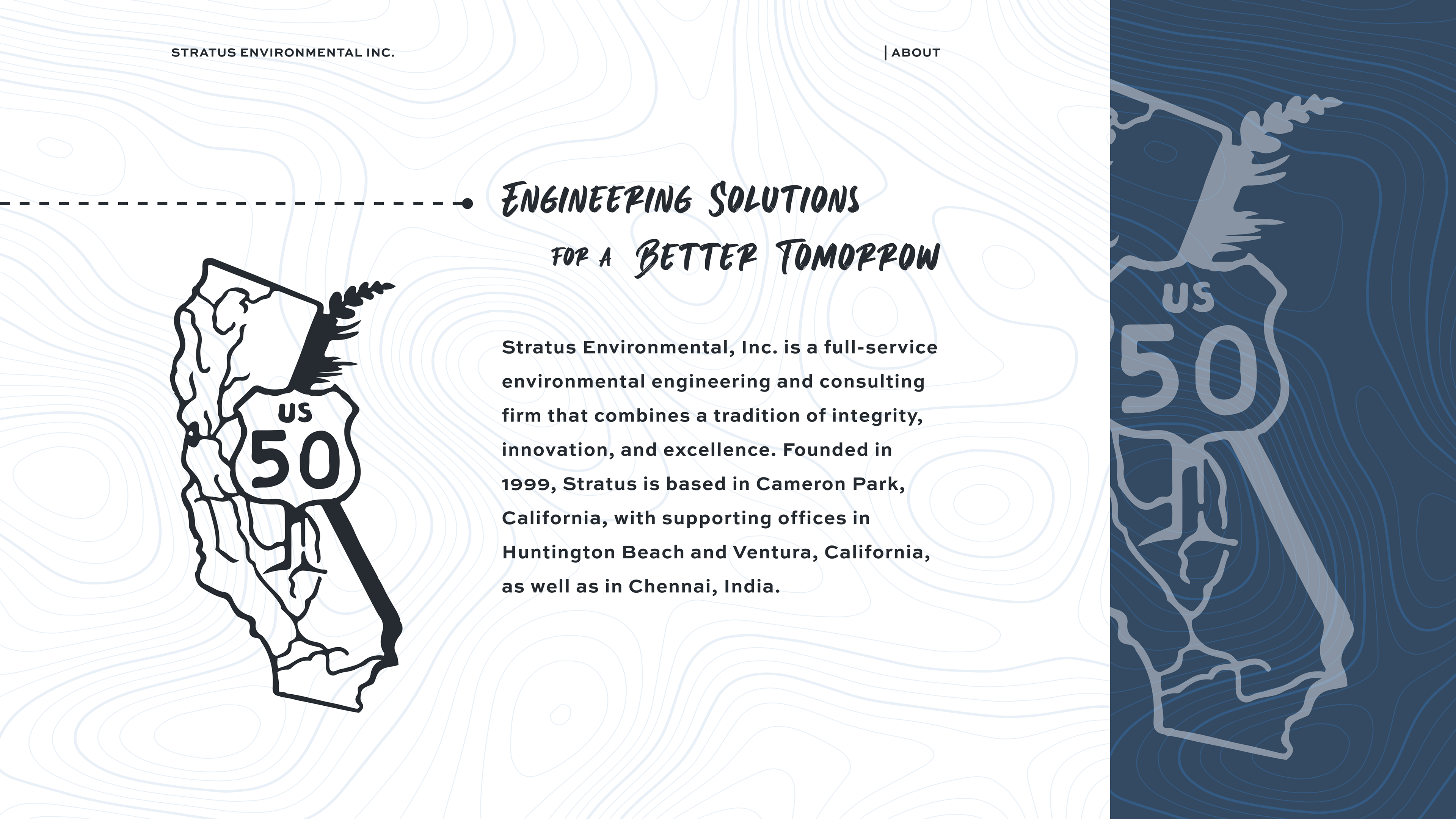
Stratus Environmental, Inc. is a full-service environmental engineering and consulting firm based in Northern California, with additional offices in Southern California and India. Since 1999, they’ve provided tailored environmental solutions through strong partnerships, open communication, and a commitment to creative, science-based strategies.
I led a full rebrand initiative to bring Stratus’s visual identity in line with its core values and evolving service offerings. I wanted to create a system that better reflected their commitment to environmental innovation, long-term regional partnerships, and their deep-seeded Northern California roots. See full case study below.
| Challenges:
Stratus had an established west-coast reputation in the environmental industry, but its visual identity lacked cohesion and failed to reflect the company’s values. The key challenge was to modernize the brand while staying true to its history, culture, and clearly communicating the full scope of their services.
• Fragmented Brand Presence: Visual materials, from internal documents to public-facing assets, lacked a cohesive design system, creating inconsistencies in how the company presented itself.
• Communicating Values Through Design: Stratus prioritizes integrity, innovation, and open communication, yet their existing identity didn’t convey these traits or reflect the company’s forward-thinking, science-based approach.
• Regional Identity & Professional Balance: The company’s environmental work is deeply rooted in Northern California, and the brand needed to reflect that local pride while still maintaining the credibility expected in technical, compliance-driven spaces.
• Limited Use of Visual Storytelling: Without custom illustrations, branded merchandise, or compelling graphic assets, the brand was missing key opportunities to build recognition and engage audiences across digital, print, and in-person touchpoints.

| Process:
To ensure the refreshed identity resonated with both internal teams and external audiences, we followed a strategic and collaborative process rooted in research, creative alignment, and brand purpose.
| Research & Discovery
Before diving into design, I conducted internal interviews and brand audits to better understand Stratus’s history, mission, and visual shortcomings.
• Team Alignment: Conversations with company leadership helped define the desired tone and surfaced shared traits valued by ownership: integrity, innovation, and deep regional connection.
• Competitive Landscape: We examined peer brands within the environmental and consulting sectors to identify opportunities for differentiation through a more distinctive and values-aligned visual system.
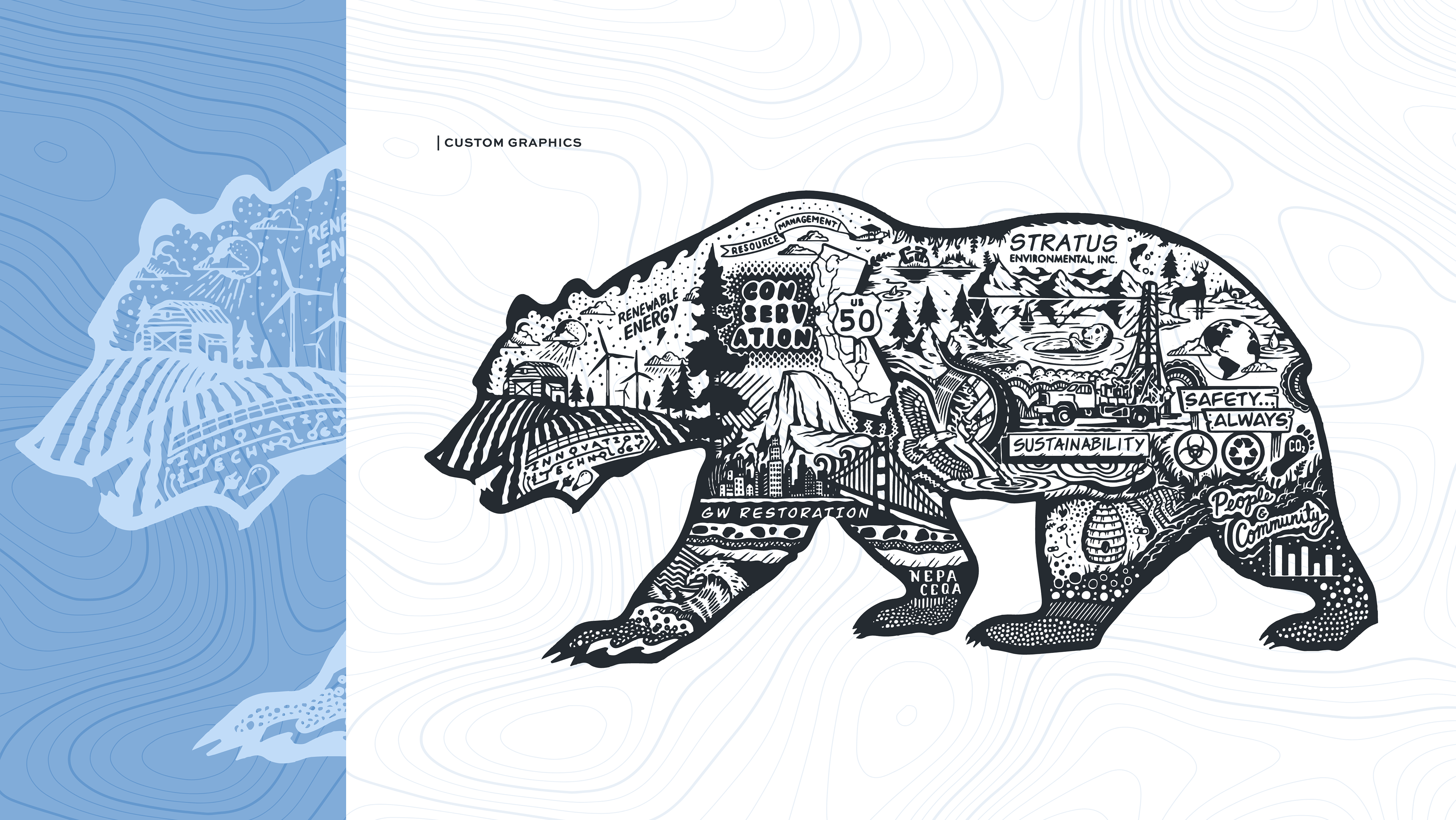
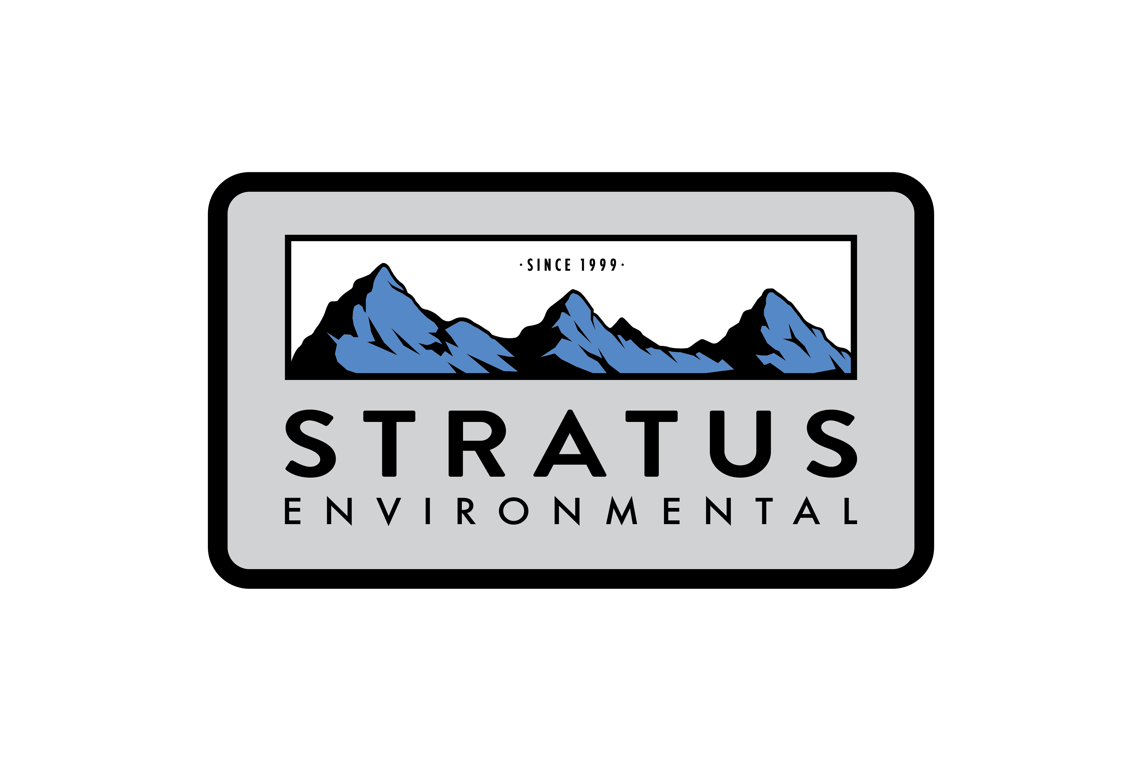
• Symbolic Foundations: The Sierra Nevada mountain range, central to the founders' identities and their geographic footprint, emerged as a natural symbol for expressing local pride and long-term environmental commitment.
| Design Execution
With a clear vision of what the brand needed to express, we moved into execution across print, digital, and physical formats.
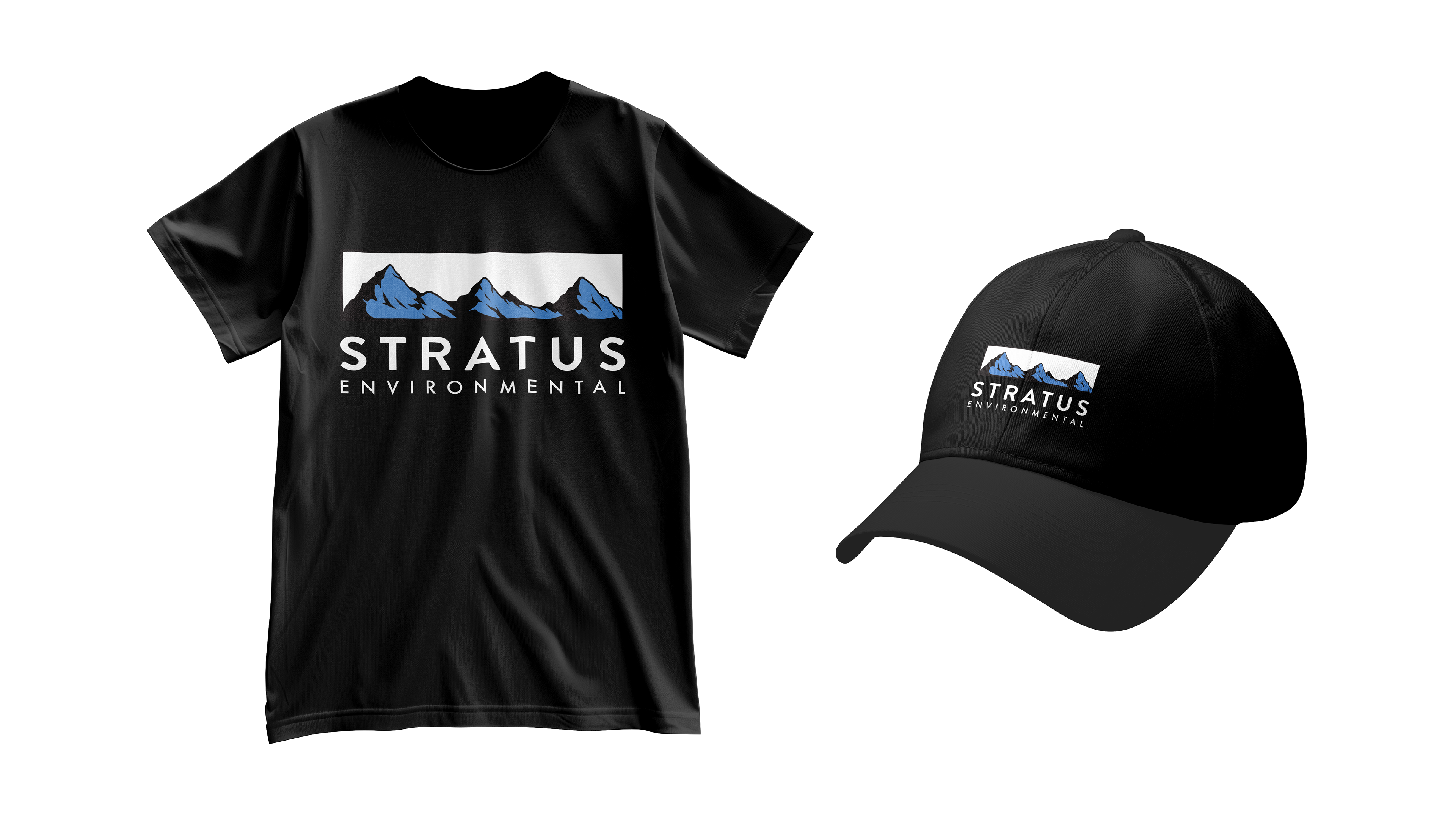
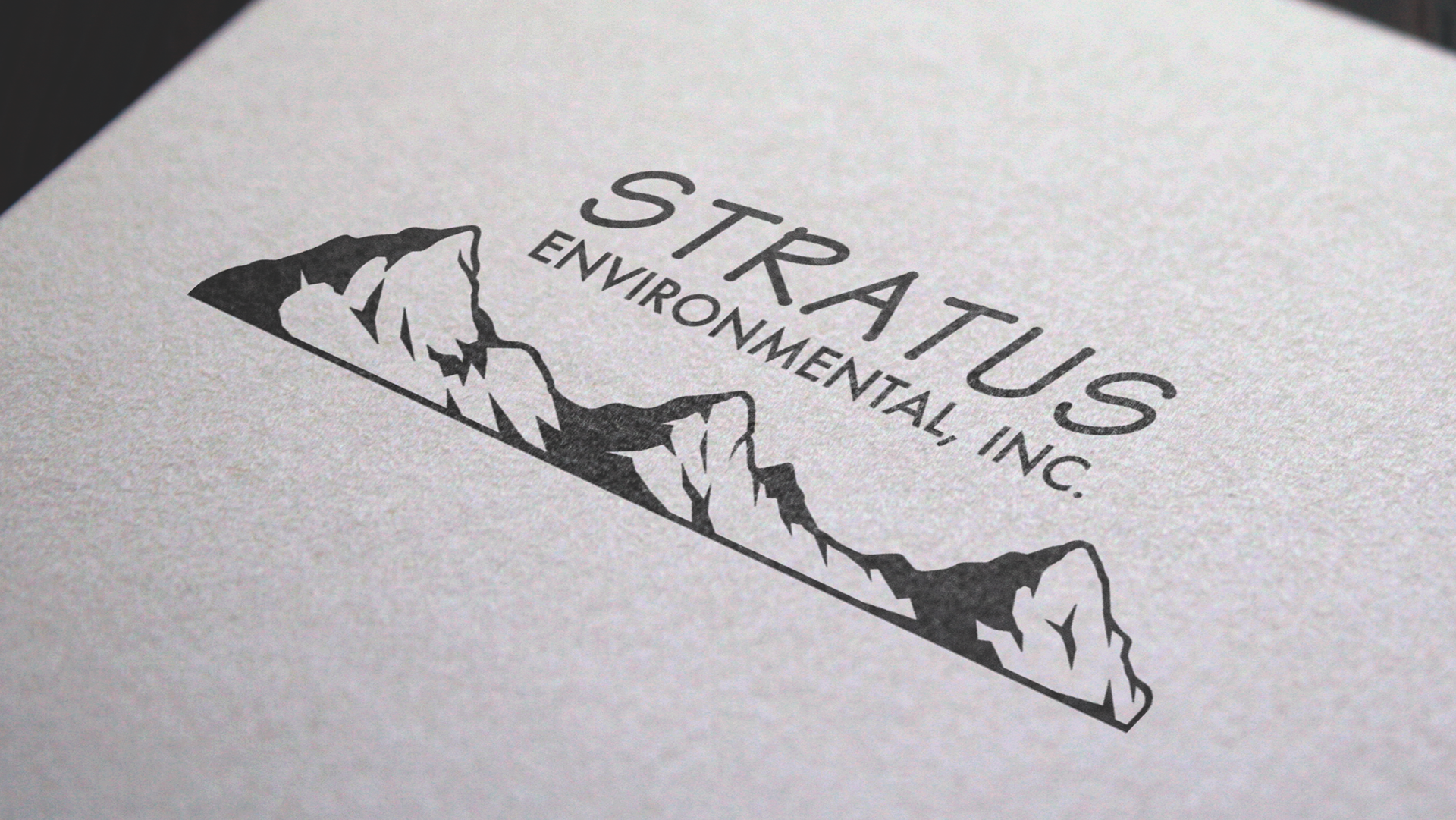
• Logo Redesign: Created a clean, scalable mark featuring stylized mountain peaks, reflecting the company’s Northern California roots and the strength of its three founders.
• Collateral System: Built out a suite of business cards, internal templates, and document assets that reinforced the new identity with clarity and consistency.
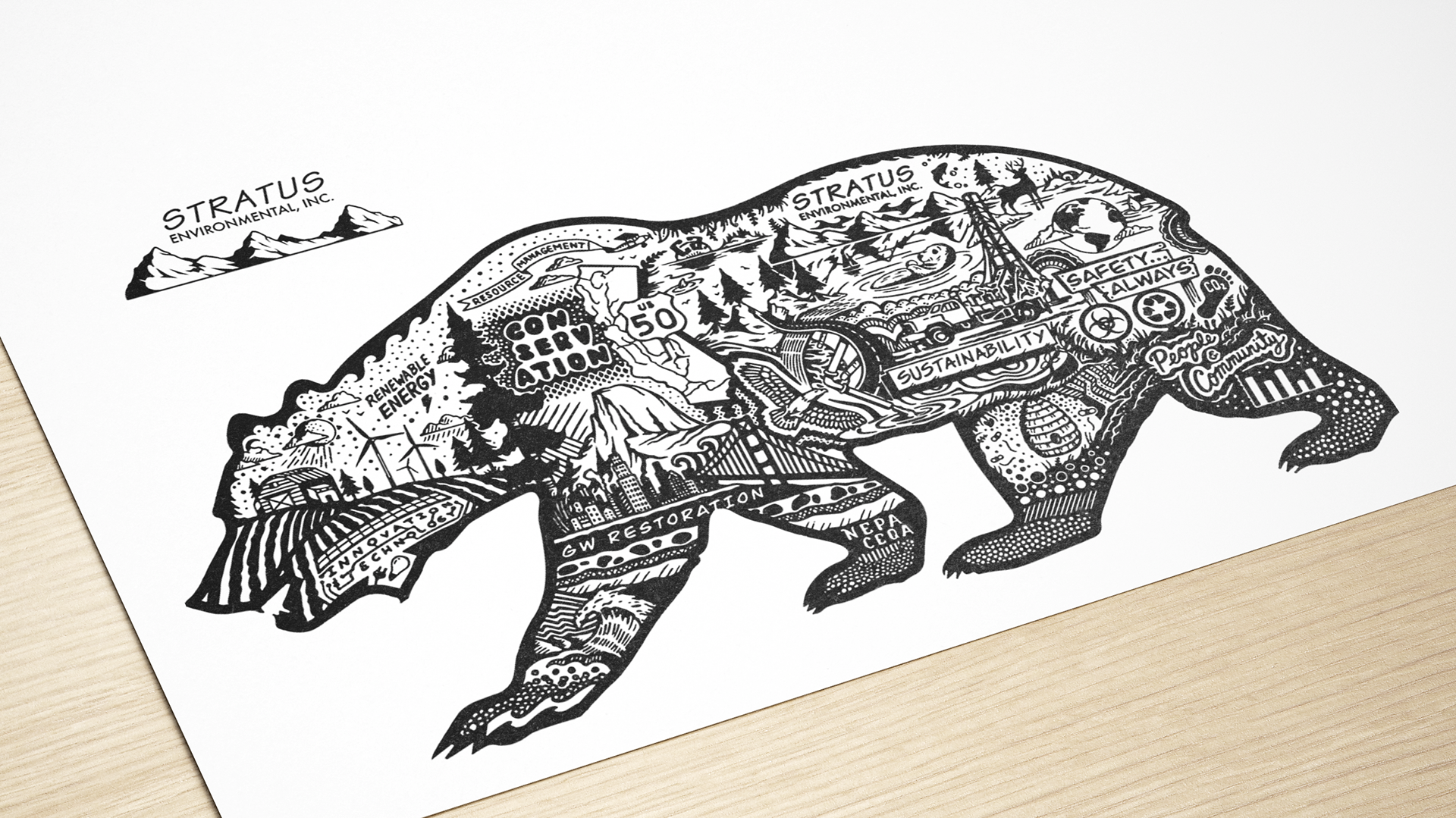
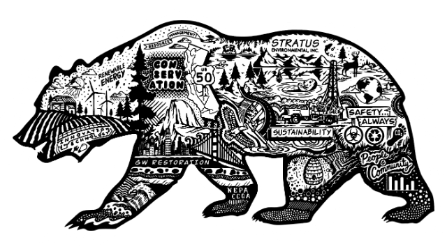
• Illustrative Elements: Designed a series of custom illustrations and iconography to support marketing efforts, drawing from local landscapes, environmental motifs, and project-driven storytelling.
• Merchandise & Apparel: Produced branded gear for employees and outreach efforts, helping build internal alignment and extending visibility in the field and at industry events.

| Result:
The rebrand gave Stratus a sharper, more aligned identity that communicates their mission with clarity and positions them more confidently across client, partner, and public-facing channels.
• Elevated Brand Perception: The cohesive system strengthened credibility in both B2B and regulatory spaces, reinforcing the company’s role as a trusted, science-driven environmental partner.
• Increased Engagement: Clearer messaging and purposeful visuals helped drive more meaningful interactions at industry events and in partner communications.
• Staff & Stakeholder Buy-In: Internal teams rallied around the new identity, citing stronger brand recognition and a greater sense of shared purpose.
• Platform for Growth: With flexible assets and a clearly defined visual foundation, Stratus is now better equipped to scale outreach efforts, onboard new partners, and evolve without sacrificing identity.
YOU MAY ALSO LIKE